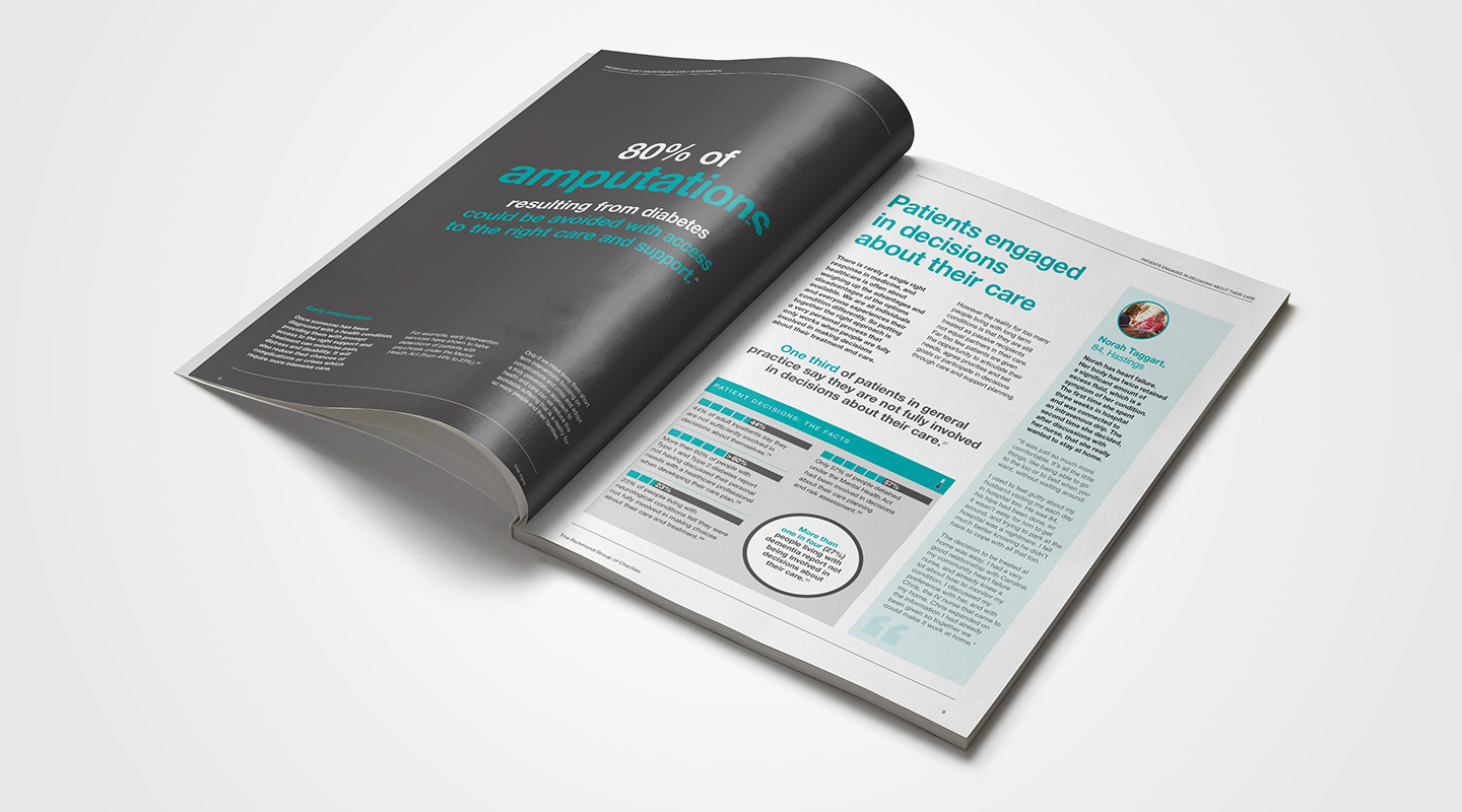
The Richmond Group is made up of some of the UK's leading health charities, and as such carry considerable influence with government. Their influencing work with government and key decision makers helps shape and improve policy and practice. Having developed a brand and design style for The Richmond Group, Oyster has also designed a series of research reports.
The challenge
The Richmond Group rely on the communication of key information to busy MPs and decision makers. The reports they produce often focus on national health issues, and contain important information that needs to be communicated to decision makers. Oyster's brief was to develop a design style and layout that presented information attractively and with real impact. The Richmond Group did not want a dominant logo, as the ten charities that make up the group already carry national influence and recognition. Often the challenge with their reports is to communicate information in a clear and engaging way that will ensure key messages are understood and acted upon.
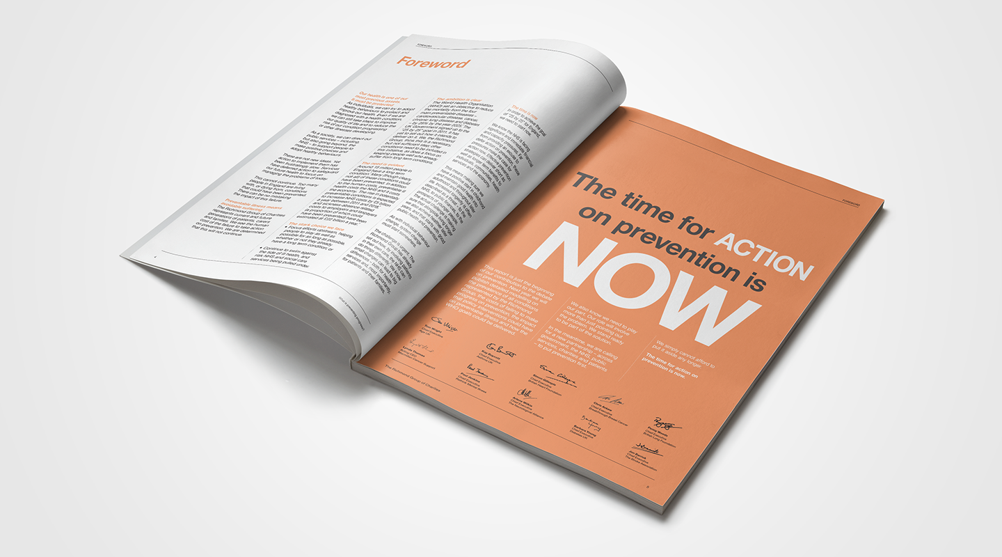
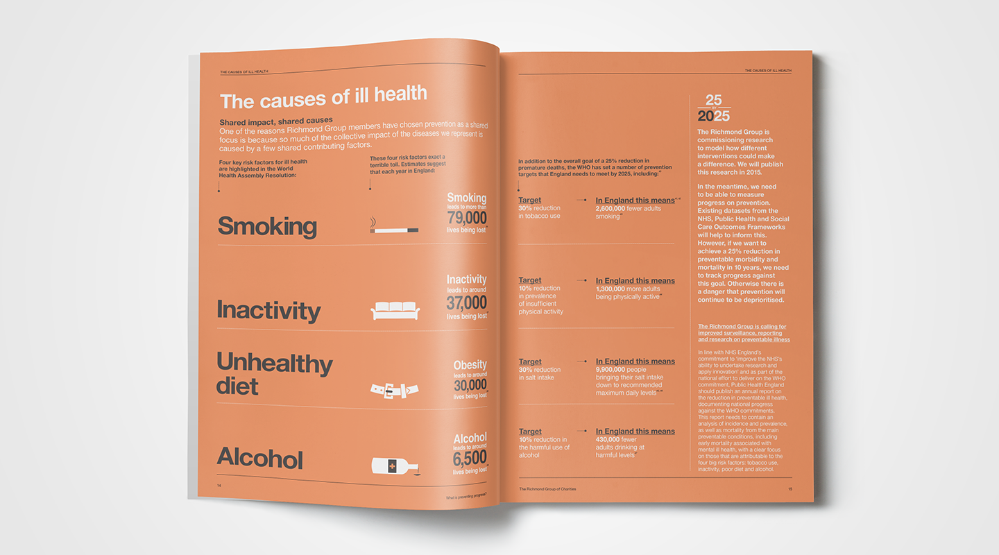
The solution
Oyster chose colours with a leaning towards the academic and medical fields. We developed striking infographic styles and used a combination of typography and graphics to ensure key facts were strongly presented. We prepared a word count guide to help control the amount of copy produced for any report, to avoid cramming information and losing the readers focus. The logo was treated more as a wordmark, with colour options that can be used in different situations. The wordmark gives brand recognition without detracting from the main member brands. The colour palette offers plenty of scope to give individual reports their own identity, whilst sitting comfortably within the set. Brand guidelines control all elements to ensure a cohesive and immediately recognised approach.
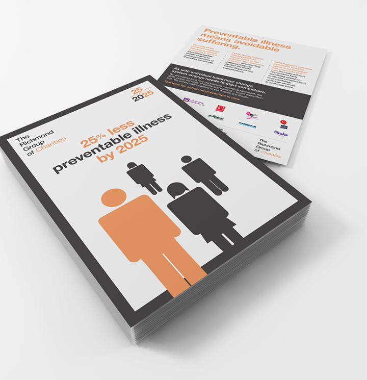
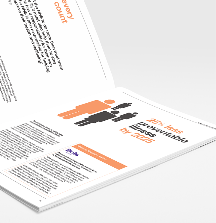
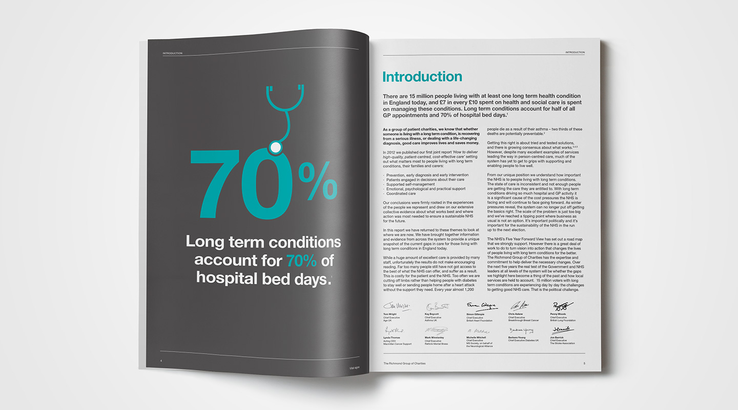
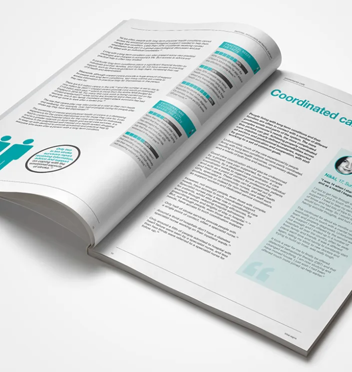
The reports follow the brand design style and we ensure that the final documents are not only professional in their appearance but also deliver critical information quickly and effectively. Oyster also advise on critical messaging and layout – the reports are always very well received.
